I admit it; I am an addon junkie. I’m constantly trying new addons and reivsing my UI. It really is a perpetual work in progress.
EDIT: For all you who want a download, I’ll try to make one later. Preistiality of Sword N Board made an almost exact copy of this UI and has it available for download now, so go check that out if you want to download it (1440×900 widescreen).
My rules when setting up a UI are as follows:
-
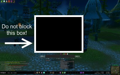
Don’t Block the Box!
The middle section of the screen, about quarter the size of the whole, needs to remain untouched. This box is sacred. My philosophy is that nothing should go there; you need to see what is going on around your character. The goal is to have an informative UI, not an obtrusive one. Combat text can go to the sides of the box, or above it. Unit frames below. And so on…
-
Subtle Colors
I think it is more important to keep the focus on the world around you, rather than on fluorescently colored health bars, etc. I keep things in shades of grey mostly; it minimizes clashing colors on the screen (I’m apparently a visual person).
-
Try to be Minimalist
I’m not a minimalist at heart, but I do believe in keeping what I see as simple and clean as possible. It is an ongoing struggle as I do run way too many addons. I’ve taken to hiding many aspects of the screen, and only have them show when I need them to, when I mouse over them, or on keypress.
-
Small on Memory
My computer has been having seemingly random seizures lately, especially while playing Warcraft (it whines … really). Keeping the memory used by addons small helps with some of the video lag and with loading times.
Those are just my personal rules; your UI is your own. (Feel free to share what you have in the comments; just drop me a link to a screenshot if you have one).
This is what I am currently using (please forgive the random bank alt screenshot):
Click to see full size (very large).
Here is an overview of what I’m using:
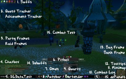
1. Buffs
-
 What I use: Buffalo
- Buffalo is a simple, easy addon to tweak and move you buffs, debuffs, and weapons buffs. I currently have buffs/weapon buffs in the upper left hand corner of my screen.
2. Quest Tracker, Achievement Tracker
-
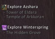 What I use: default UI quest tracker, Urban Achiever for achievements
- I haven’t found a quest tracker yet. Many have more features than I want. Although, in the quest frame, I do use DoubleWide to allow me to see more of the quest text in the frame. Urban Achiever (tracker shown right)
3. Party Frames, Raid Frames
-
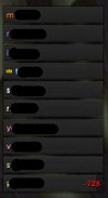 What I use: Pitbull 3.0
- The party frames mirror what my player and target bars’ appearances. The raid bars are simple, single bar frames sorted by class. I only show the party frames when I’m not in a raid (and vice-versa). Each has a clear label of the health deficit (how much healing is needed) on the right, and the player name on the left. (Names censored in screenshot.) I sort my raid by player class, not group.
4. Chatbox

- What I use: Prat 3.0
- Prat has many features, of which I probably only use five. The great thing about it is that you can disable the features (called modules) that you do not use. Prat can change the look of your chatbox, help you manage your channels, give you quick shortcuts, and more.
5. Stats
-
 What I use: SLDataText
- SLDataText will put a clock, framerate, memory, bagspace, tracker, mail indicator, and more, on your screen. You can easily configure what you want to see, in what color, where and in what size. This has become my psuedo-replacement FuBar.
6. Player / Target Frames
-
 What I use: Pitbull 3.0
- I use a version of Pitbull based off of Beska’s UI (formatting) and Metz’s UI (strong grey color scheme). Since these screenshots were taken, I have lightened things considerably.
7. Threat Meter
- What I use: Omen 3.0
- I have configured the look of Omen to perfectly mirror the target buffs/debuffs tracked by Quartz. Omen goes under the player frame. Quartz under the target’s.
8. Bars
-
 What I use: Bartender 4 and Autobar
- Bartender allows you to move your action bars, add or remove them, change their size and shape, andother nifty features (such as simple paging). Autobar automatically give you buttons for your mount, health potions, mana potions, food, drink, class buffs, etc. It needs very little configuring, and will autodetect all your items for you.
9. Buff / Debuff Tracker
-
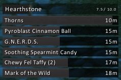 What I use: Quartz
- My target’s buffs/debuffs casted by me are tracked by Quartz. This is especially helful when I play as shadow (easily see which dots are on the mob and which need to be refreshed). Quartz also replaced by casting bar, and gave me a casting bar for my target. (Since taking these screenshots, the color of the casting bars has been lightened.) If you are patient enough to spend 5 minutes configuring Quartz, you can really get a nice end product.
10. Combat Log
-
 What I use: EavesDrop
- I hate the combat log. It is large and cumbersome. Eavesdrop gives me a super-simplified version of the combat log that you can scroll through, use to keep a history of “high scores,” and give you a combat summary at end of battle (damage in/damage out). It can be as small and simple as you want it to be.
11. Minimap
-
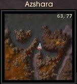 What I use: SimpleMiniMap
- There are literally a million and twelve minimap replacement addons out there. SimpleMiniMap is just another good, easy to configure one. The background of the frame is done with eePanels. The zone text is done by SLDataText. SLDataText removed the tracker menu and made it text based. All minimap icons were removed, too. I hate those little buggers.
12. Tooltips
-
 What I use: TipTac
- I enjoy having a little extra information in my tooltips (talents, rank in guild, etc.). I used to use CowTip, which had so many options, but took forever and a day to configure. TipTap comes already configured, looks great, and still gives you the option to add or remove certain items.
13. Bag Frame, Bank Frame
- What I use: Bagnon
- Baganon will show all your bags (or all your bank) as one giant bag. It gives you options to toggle off viewing certain bags (ammo, shards). It has a search function. It can keep track of what you have on other characters. And it will let you view your bank from anywhere.
14. Debuffs
- What I use: Buffalo
- Same as I use Buffalo for my buffs, I also use it for my debuffs. In the name of keeping the more pertinent information closer to the center of the screen, the debuffs show right below the character name on the player unit frame.
15. Scrolling Combat Text
-
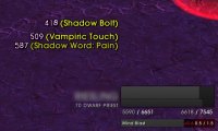 What I use: Parrot
- I do not like the Blizzard default Scrolling Combat Text. I use Parrot, which has many nice features. You can easily change the font, size, color, alignment, location, and animation of any kind of alert (buffs, damage, etc.). I have the text align over the name text on the player/target. Buffs and other alerts happen on the top center of the screen.
Other Addons not Listed:
- _Cursor – Makes your cursor leave a trail.
- BigWigs – Raid boss timers.
- ButtonFacade & ButtonFacade_DSM – Changes the borders on buff, autobar, and action bar buttons.
- eePanels – Allows you to make backgrounds (bottom bar, minimap, etc.).
- EQCompare – Gives you an item compare frame.
- Examiner – Improved character inspection frame.
- GatherMate - Remembers where nodes, herbs, etc. were on your map.
- Hat Trick – Quick toggle on character pane of hat/cloak.
- Item Rack – Easy gear swapping.
- LittleWigs – Boss timers for instances.
- Mapster – Add features to your main map (coordinates, etc.).
- OmniCC – Puts cooldown counts on your buttons.
- oRA2 – Raiding helper (lets have main tank frames, assists with ready checks, etc.).
- Postal – Mail helper addon. Can open all your mail for you. Keeps a list of favorites to send things to.
- Rating Buster – Shows you how an item will affect your stats.
- SellFish – Displays sell value of items in their tooltip.
- SharedMedia - Gives more options for background textures on items (such as Pitbull’s unit frames).
- Skinner – Allows you to change the look of the backgrounds of the whole UI. I have changed all of my Blizzard default frames to be black.
- tekability – Shows durability on items on your character pane.
- tekErr – Keeps track of all your interface errors/bugs.
- tekJunkSeller – Automatically sells your grey items when at a vendor.
- tekticles – Lets you change all the default fonts.
- VendorBait – Will highlight the item with the highest sell value on quest rewards.
- XLoot – Improved loot frame.
Things I Still Need to Do:
-
Simple Quest Log
I have yet to find a quest log replacement that doesn’t have a million features that I do not want or need.
-
Better Unified Elements
Overall, I think my UI feels scattered. I think I need to rearrange a few things (buffs, for example) to bring things together better.
-
Better Buff Filtering
I have Pitbull to show me a few buffs that people may be missing, but I would really just like an addon to tell me instead of it having to appear on their unit frames (I used to use XRS for this).
-
Memorize Keybindings
Every time I redo my UI, I find a better way to bind my abilities, and have to learn them all over again. Once I memorize more, I can remove buttons from the bottom of the screen (there are too many!).
-
Decrease Memory
I run with about 30MiB of addon memory. I’d like to see that smaller.
Bonus Screenshots:
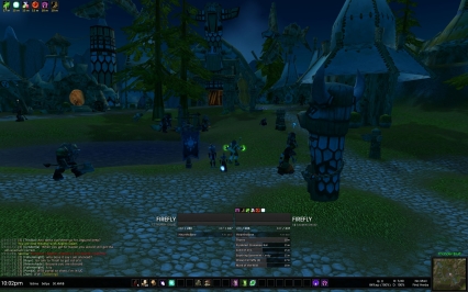
In a party:
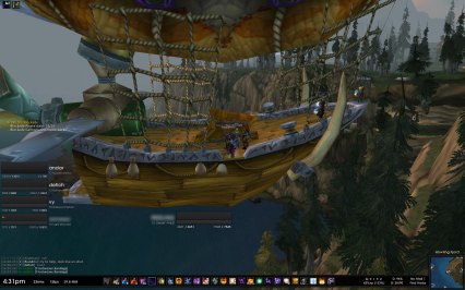
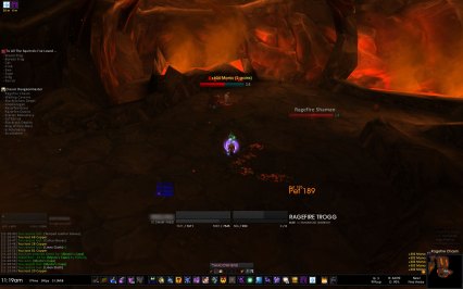
In an instance, in combat, and with a pet:
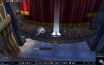
In a raid:
I love this UI, is it possible for you to put the entire thing up for download? It would take me hours to re-create it.
Cork is nice for missing buffs. It’s written by Tekkub, so it’s very lightweight. Your UI looks pretty sleek. We practically use the same addons, aside from me using Data Broker, but yours manages to look nicer.
I tend to spend hours tweaking my UI, it’s almost as much fun as playing the game itself. :)
Your UI looks great. I can spend hours fiddling with my addon settings, and it still looks too cluttered! I’d recommend Cork as well for the missing buffs.
Thanks for all these suggestions. I’m a big fan of add-on experimentation too, and having recently switched from a (resto) druid to a (shadow) priest, I’m just lookin’ for an excuse to totally revamp my UI. :)
Another great post, do you think you could post the full size images of your UI? I’m always trying to improve my UI and I’ve been looking for something that you can use to search through achievements so thanks for the list!
Can we pls get Interface and WTF folder pretty please…
I use nQuestLog it is fairly simplistic but has to be fixed (the fix is in the chat on the Curse site for it) after the last patch changed the error frame code slightly. I find it to be similar to the basic tracking system but allows me to move it and resize it.
For the keybindings, may I suggest Clique? I find it to be awesome and highly recommend it. It’s easy to set up and has its own tab in the spellbook.
Some suggestions:
QuestGuru for quest log that has quest history, customisable tracker and doublewide-like functionality:
downloads/wow-addons/details/quest-guru.aspx
Pawn for any serious in-game theorycrafting. It allows you to setup gear presets based on stats weightings that is displayed in tooltips or in comparison frame. I have setup as per your very helpful guide so I always know right away whether a drop is an upgrade to my current gear:
downloads/wow-addons/details/pawn.aspx
RegenFU (either as plugin for the most excellent FuBar or stand-alone). Track your FSR stats and have a graphical bar (mine setup right below Quartz main bar) to optimise your mana consumption:
downloads/wow-addons/details/fu-bar-regen-fu.aspx
I also moved away from player frame completely and replaced it with IceHUD (showing my mana and health only). Then again, it’ll probably violate your don’t touch the box rule ;)
Btw, eePanels is a resource hog, kgPanels is the next big thing.
[...] UI Awesome trailer Infinite line RPG for DS [...]
I admit it. I’m addicted to Healbot. I’ve lived my whole life, now fully kara geared, using it. On your holy priest do you use it? or anything similar?
Oops. Forget to mention: I love your site. It has helped me enjoy the game much much more….
Quick question for anyone, how do I get rid of Blizzards player unit frames/icons on my screen? I am using healbot currently in groups and may try to change to pitbull. Great website. Thanks
For all you people out there i have created a copy of this UI and added it to my blog for download. I will preface it by saying that it is a start and something i whipped up while bored at work so please be patient while i finalise the colours and final settings.
http://www.swordnboard.wordpress.com
[...] liked https://dwarfpriest.com/2008/11/17/reworking-my-ui/#comments so I decided I would try and make it my [...]
Looks great, I love minimalistic look and I never considered the “grey theme” which is superb idea. although adding more addons won’t help you with memory hogging, here’s one you’ll love if you try it :)
For missing buffs: SmartBuff, set it up once for solo/party/raid (what buffs, buff foods, flasks/elixirs, scrolls, poisons, etc you want to use) and just rolling the mouse wheel will put all needed (configured) buffs up.
That is a seriously gorgeous interface. It’s given me a couple of good ideas for my own – thank you!
When I started playing world of warcraft I stayed with the default UI for quite a while. Eventually I realized that (as a rogue) I was looking at the corner WAY to much. So my new mantra became “eyes forward”. As such I’m very much into using a HUD now (meta hud til that died, now IceHud), and that is sort of opposed to your sacred area.
For the most part I’ve tried to keep it simple, but there always seems to be just one more thing that could be a tad better. Great list of addons! I can’t wait to try some of them out. That’s the annoying thing about addons, there are a million of them, they have wacky names that don’t mean anything, and quite a few aren’t what you really want.
[...] but he says that it isn’t finished yet. He was just so impressed with how Dwarf Priest did her UI that he wanted to see if he could use something like that as a [...]
Sickdk UI has been updated and is now ready for download.
visit, http://www.swordnboard.wordpress.com for more info.
I have updated the UI at Sickdk visit the link above, numerous items fixed and many small issues resolved.
Please download and try,let me know of anything you many like dislike. i.e. fonts’ colors what ever.
Dwarfieee? What about that ‘every day a new post’-issue? Still running? ;)
Hi,
Just making sure things are ok!
Hey Dwarf Priest,
I was wondering if you do plan to release a full compilation of this UI – I would really like to give this specific one a try. I will love you long time, pretty please?
[...] is my current interface, I’m a holy priest. Strongly influenced by the UI on A Dwarf Priest seen here. Solo: Grouped: BG: Quick addon summary of most visible: Pitbull Bartender4 Chinchilla Prat [...]
[...] and then I will go through all the mods shown. I did indeed copy a lot of formatting and mods from A Dwarf Priest’s UI because I liked how clean and shiny it [...]
[...] What got me reading that website was this post on dwarfpriest.com. [...]
hi; gr8 site … but missing the button “download all” werry much :(((
would save hours :(
I was tempted to download Sick DK but after a closer look i didn’t feel like it was a good enough replica.
The colouring scheme was completely ignored, the panels didn’t look the same and took alot of memory. So I figured I’d rebuild it myself. I am still working on it and planning to release it to the public. Credit will go to dwarfpriest ofc!
[...] mind you, in order to "work from home" — all I wanted to do was to try out some of the add-ons that A Dwarf Priest had recommended on my PC, while finishing up my workday on my laptop. Multitasking [...]
I’m fearful that the Pit bull needs a particular type of owner…these dogs, no matter how ‘supporting’ nevertheless have teeth, are nevertheless creatures with out moral principles and once they DO bite, won’t let go. As in all animals…some tend to be a lot more suseptable to instinctual behavior and time and time once again, this breed tends to do just that.